
Death Blade
About
Death Blade is a Roguelike First-person Slasher where you fight your way through the Yakuzas heavily guarded tower. Every playthrough is different thanks to the levels, enemies and Augments being randomized with each playthrough.
This was our second Game Project at Playground Squad, it was also the first time our school tried out having fewer but bigger groups (about 18 people). On top of that, about half of the project was made from home due to Covid-19 restrictions put on schools during this time.
Below you can read more about some of the designs and decisions I was specifically responsible for.
Link to our game on the schoool homepage:
Main Role: Gameplay Design
Team Size: 5 Designers, 3 Programmers 10 Artist
Time: 9 Weeks
Engine: Unity
Platform: PC and PS4
Genre: Single Player, First Person Action, Roguelike
Enemies
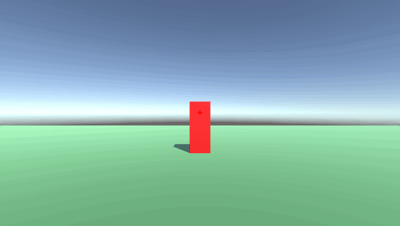
Me and another designer were in charge of creating two special enemies each. My additions were The Alchemist (Later renamed Hacker) and The Splitter (Eventually cut due to time shortage).

Now known as The Hacker is an enemy whose attacks, if they manage to hit the player, will obstruct his or her view.
The only way to get your vision back is by moving in any direction.
One of the pillars of this game that we decided on early was that we want to keep the player moving and engaging combat at all time. Since the players vision is a necessity the risk of loosing it will force them to keep moving and dodging their attacks. And still, if the player were to get hit, the only antidote is more of what we want them to do, move, but now at a higher risk.
In order to not make the enemy too oppressive I made it so that if the player is already blinded by an hacker-screen, no hacker can attack until it has been cleared. Having two to three of them constantly obstructing the player view would quickly make it frustrating and unfair rather than challenging and dangerous.
Below is a couple of gifs from my prototype that I used to pitch it. Eventually I did experiment with it fading out instead of going from 100 to 0 in an instant, which is also what we eventually decided on.

My other special enemy, The Splitter, as its name suggest did just that, split into several enemies.
The main idea behind him was that even though we want the player to play aggressive we still want them to make a decision in their aggressiveness, and not just slash aimlessly.
The risk of essentially creating even more enemies would encourage the player to make a decision on what enemy to attack and when. If the player was already overwhelmed creating more enemies would create more problems.
But sometimes the player might be in need of more enemies or under the effect of a strong augment which excels when there are more enemies.
Below is a gif from my prototyping with it. Initially it only split into two basic enemies but we played around with the idea of having more enemies spawn depending on how far up the tower the player current was.
As previously mentioned this enemy was eventually cut due to the workload already put on the artists. We decided to rather have fewer, but more polished enemies, rather than this one extra.
We did have a discussion about which one to cut but the axe eventually fell on this particular enemy.
The decision heavily came down to the fact that The Splitter had had substantially less work made to it that far, and not necessarily because we were displeased with what it brought to the game.
Player
Our playable character can move around in the world space at a pace that is slightly faster than the enemy.
She can also attack and dash. To keep the player moving and attacking we made it so that she regenerates energy, which is her resource for using dash and attack, while moving.
Additionally the player will regain a small amount of health and energy when successfully hitting an enemy and a larger amount if the enemy succumbs to the damage.

One of my proudest additions to the player is a short invulnerability that applies when the player suffers fatal damage. Instead of dying the player have her health set to and can not go below 1 health, for a very brief period.
The idea behind this is to avoid having the player blow up suddenly from damage they did not anticipate, but also to put the player into a adrenalin rush from hanging on to their life by an inch.
Although, this can not take affect again for a decent amount time afterwards.
The trickiest part about this having the desired effect however is to make sure nobody knows about it. If players were to learn about this they might use it as a crutch rather than what it is intended to do.
To keep this a secret from even the members of our group we only let one programmer know about it, the one mainly in charge of the player code, on top of that I wrote the code myself.
So now that you have read this, I might have ruined it for you. Sorry.

One major part of the players progression is the Augments. With every floor completed the player would be presented with a number of Augments to pick from.
In a total there are nine unique Augments, not counting the three flat stat improvements presented every other floor.
The same Augment can appear more than once, even after is has been picked, to make it more powerful.

Out of the pool of Augments three are randomly selected for the player to pick from when she beats floor one, three and five. For beating floor two, four and six she get to upgrade one of her stats, Strength, Dexterity or Endurance.
Since the floor is always randomly generated the path to the next elevator can sometimes be shorter than others so to give the player an incentive to still go through that floor we made it so that the player will only have her third choice if she deals with a vast majority of the enemies on that floor.
Moving on to talk more specifically about some of the Augments I will mainly talk about the ones I designed, and my thought process behind them. Two things that was important to me to remember when making these Augments were that they should not add a substantial amount of work since artists and programmers had plenty on their plate already. And also that the Augments should somehow hold on to and further the games main pillar which fast and engaging combat.

First up is Harvest which makes it so that whenever the player kills an enemy, there is a chance her Strength (which affects all damage dealt) and Dexterity (speed of the players attack) will increase significantly for a short duration.
The idea with this one is to further reward the player for killing enemies, thus making it more appealing to engage and remain in combat. Also because of its rather short duration I want to entice the player to keep going after killing an enemy and gaining the buff, which leads to faster combat now that she is under time pressure.
Each time the player pick this Augment the chance of it activating after a kill increases and the time it lasts extends.
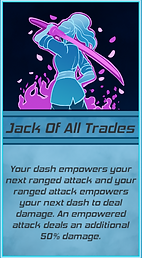
Next we have Jack of all trades which turns the players dash into a deadly weapon if and after she uses her projectile attack, also, after a dash her next projectile attack deals additional damage.
My goal with this one was to provide something that it promotes a mixed play style. Rather than spamming one attack the player now benefits from weaving in the dash or projectile attack in front of the other. On top of that players who tried to go for a projectile and/or dash heavy build can both benefit from this.
Each time the player pick this Augment the damage the dash deals and the additional damage of the projectile attack increases.

The next to last Augment I designed is simply called Powerhouse. By getting this Augment the player will get some of her max energy back whenever a projectile attack hit an enemy.
The basic cost of the projectile attack is rather high, this is because compared to the auto attack it is a bit safer due to the distance, but also deals a sizable amount more damage.
We did however not want to shut the door of building a projectile centered build, which is what I aimed to to do with this Augment.
This alone will not make it viable to spam nothing but the projectile but it will bring the bar down a bit. Additonally since it replenish an amount depedngin on the player max energy it will synergize well with the Endurance (Increase energy pool) stat upgrade.
Each time the player pick this Augment the replenish amount increases.
The last of my Augment designs that also made it into the game is Doom Dasher. This Augment grants the player a chance to execute a free projectile attack, in the direction they are looking, at the start of a dash. Initially it was at the end of the dash but after play-testing we realized that doing it at the end of the dash makes it less aggressive and more difficult to hit since you dash past several enemies already.
What I aimed to do with this Augment was to promote how a Augment by itself can seem weak but once they mesh with others it can grow really strong. Since this essentially gives the player a chance of getting two energy-based moves for the price of one, but they still benefit from both the player stand to gain a lot form it.
Take the Powerhouse Augment previously mentioned as an example, the projectile attack from this Augment would replenish energy from that Augment.
Each time the player pick this Augment the chance of having the projectile attack execute increases, to a max of 100%.

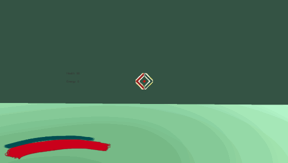
To end this Player segment there is one more Augment I did not add but did some work on. The Augment is called Split Shot and it does just what the title eludes to. Instead of firing one projectile the player now fires two additional projectiles at a wider angle. This is one of the three Augments that were in the game already at the pitch phase as an example Augment but managed to stay all the way through. But since it was in there before we had a game to test it in I made it in my prototype so we could test out angles and number of additional projectiles.
The number in the top right corner is the angle increase with each projectile.

UI Elements
We decided early on that we wanted to avoid having the UI take up too much space since the player needs to see and keep track of a lot of things moving while playing such a fast pace game.

One of the most important parts of the UI with many first person games, especially in a game with precis attacks and the ability to fire at targets. On one hand we want to keep the player from having to look away from the center while in combat so that they can focus on the enemies before them. But at the same time we want to avoid cluttering it up too much since it can quickly become obstructive.
Using my prototype we did test several different placements of mainly the health and energy bars since they are always important to keep track of.
Although we saw through many different kinds of bars and placements the two above were the ones it came down to in the end. The classic bar in the lower corner, or a center piece that provides the most vital information right where we would expect and want the player to look.
We asked around among people who were not designers and even outside of our group as we were making our decision and even though the bar gained a tad bit bigger following we ultimately decided to go with the center placement diamond. In the end though I still believe we made the right decision.
Another part of the UI that we however decided to put in the lower corner were our Augments.

The Augments who apply some type of effects that is limited to time or otherwise could be important to the player get a small icon in the lower right corner which telegraphs whatever information might be important.
In the above picture we can see Patient Sniper which increases the damage of your next Projectile attack by 50% which stack, to a maximum of 300%, for each wide slash that hit at least one enemy. This icon keeps track on how much the current amount is. Next to it is a timer for the Harvest Augment to help the player keep track on how long they have the correlating benefits.
The third and last obvious thing in the UI is the mini map in the top left corner.
The mini map was heavily debated up until the very end, which also made it one of the very last och least polished elements of the UI. Mostly this is because us designers wanted to ship the game without a mini map.

So to understand why we did not want the mini map I would first like to present the reasons that speak against it.
First and foremost it is a pretty big thing for a UI we did not want to fill up with too many elements.
Second is that what the player is not supposed to know is that the lobbys always spawn in one corner each, then the rooms and their position that connect the two are randomly selected, thus making the route and each floor layout unique. With a map however it becomes pretty obvious to roughly figure out the way and current layout.
On the other hand, being lost was never an intended feature of the game, nor does it go along with our philosophy of fast and action filled gameplay if the player has to stop and think about which door they came from.
We did try to bypass this by adding a "clear" sign in the doorway of rooms you have already been to in an attempt to avoid the player getting lost for too long along their way.
While this did relieve some of confusion, especially if you developed the game and had all the knowledge of how things work behind the curtain, it was not enough for new players and sometimes even members of the group.
That is how the mini map eventually still made it into the final build. Although there is a button to toggle it on/off for anyone out there who would like to test without it.

One of the very last things I added to the game, which is somewhat part of the UI is a slight tilt the camera makes when the player move in any side way direction. This is to make the movement feel more smooth, and despite the fact that I wrote the code myself everyone who tested it think it turned out pretty good.

